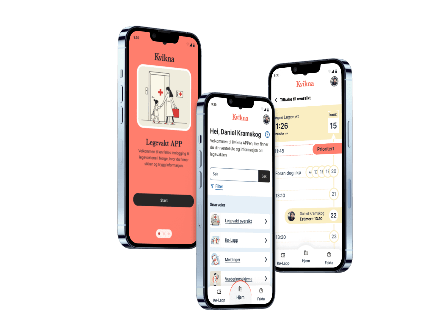

Kvikna
Building a mobile application designed to help you shorten your waiting time at the emergency room and reduce the stress of healthcare staff
Intro
As our final exam in UX-design, we were assigned to do an open or closed brief. I have been working together with two other students since almost 2 years back and we have a very nice work ethic and friendship together. So an open brief was our choice. We realised that, we as a team, could do any project. The bigger the challenge, the better the result! The project we chose to do was to help a real company with a real problem, Kvikna.
Problem
Population is increasing and people are getting older, this in combination with not enough educated staff and shortage of doctors is putting a lot of pressure on healthcare systems. To avoid a massive crisis within 5 years, a working solution that engages patients in a meaningful way to help prioritize and deliver the right care faster is needed.
Solution
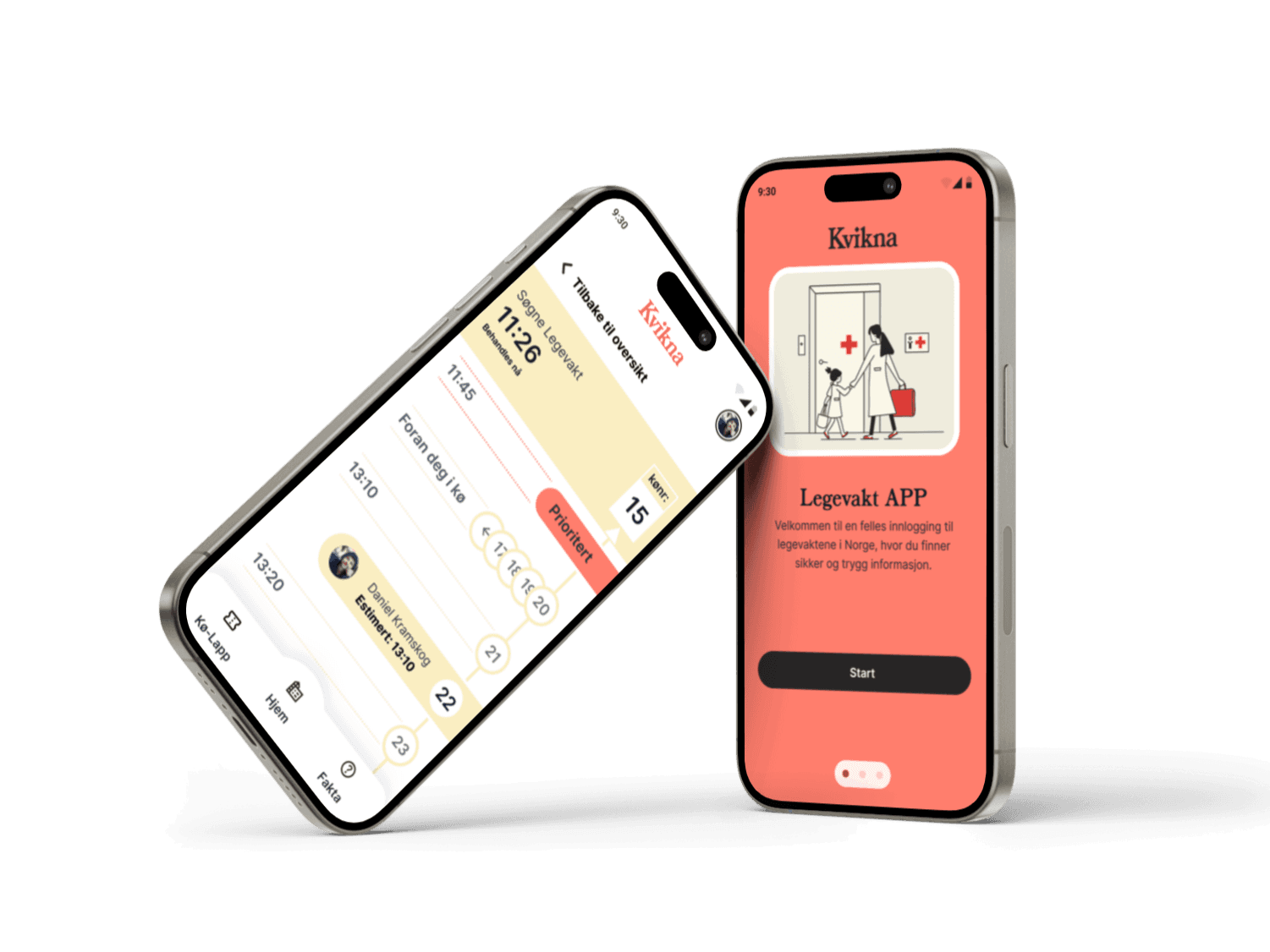
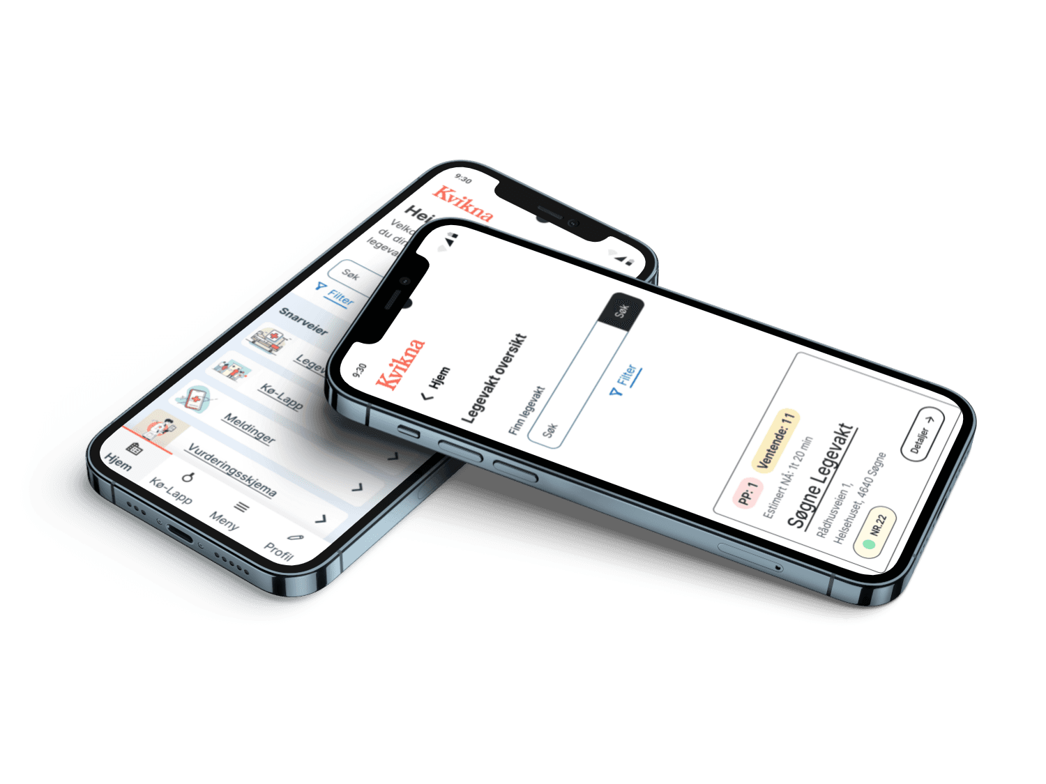
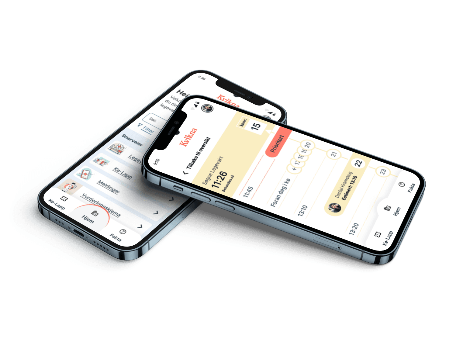
The Kvikna app is a potential solution, with self-registration and a queue management system designed for emergency rooms. By letting patients to self-register and assigning them in a queue, with the possibility to do it outside of the emergency room, Kvikna could free up valuable time for staff and patients. Real-time queue information, estimated wait times and further explanations would reduce the stress of waiting.
Overall, the Kvikna app is addressing the issue with longer wait times in the healthcare system. It would benefit the understanding of wait times and it would lead to better communication, leading to better and faster emergency room services.
Role
Role
Role
Project
Project
Project
Collaboration
Collaboration
Collaboration


Step 1 - Empathize with the user of our product
As we started our project we knew that there were no app for patients to manage their waiting experience in the emergency room. Kvikna is a company that are building a system to solve this issue. At the start of our project, Kvikna did not have a solution for the patients and we were asked to focus that.
Myself and two other students started to do extensive research to develop a deep understanding the challenge.
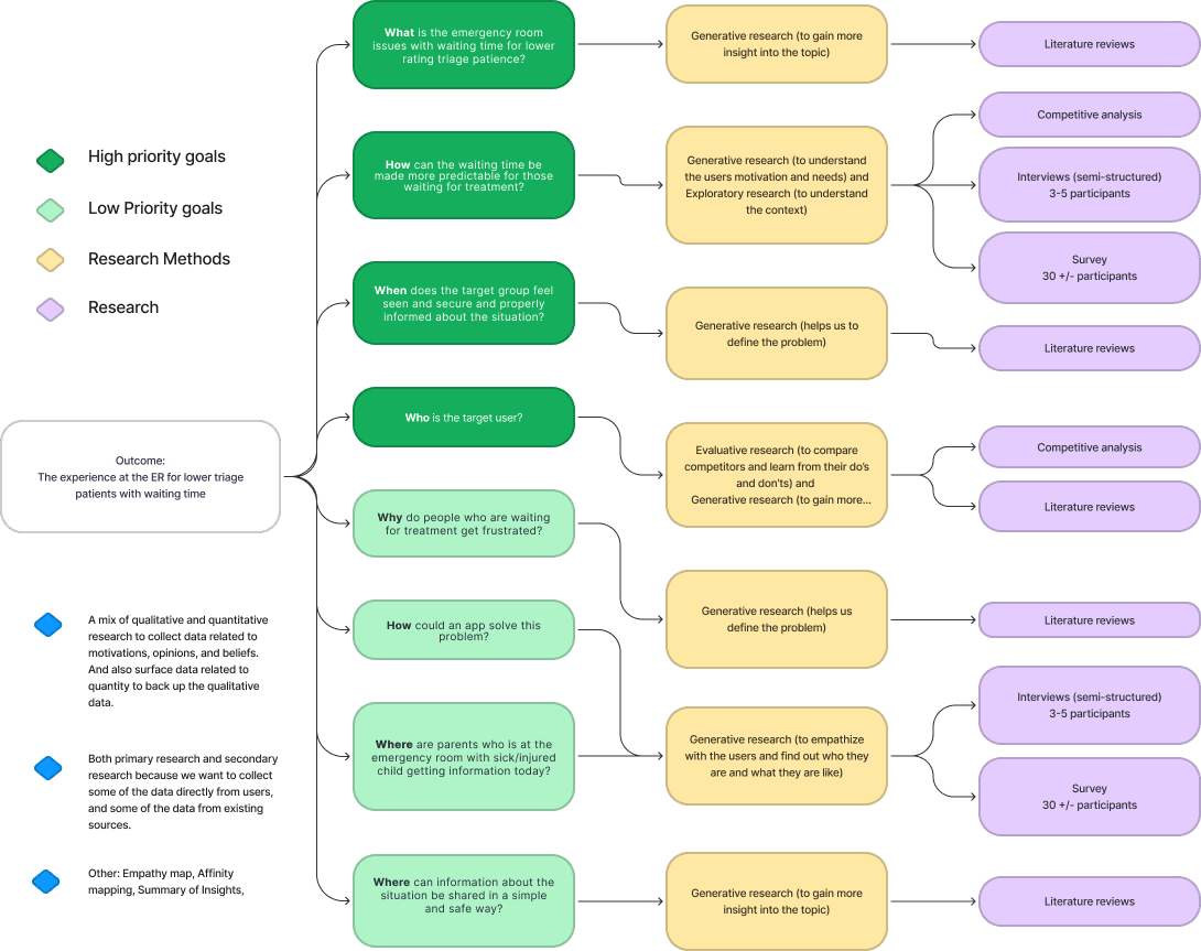
First thing first, we need to have a research plan and set the goals for our research.
Using the 5W1H method we found many issues to deal with, but decided as a group what to set as main- and sub-goals.
Main goals
What is the emergency room issues with waiting time for lower rating triage patience?
How can the waiting time be made more predictable for those waiting for treatment?
When does the target group feel seen and secure and properly informed about the situation?
Who is the target user?
Sub goals
Why do people who are waiting for treatment get frustrated?
How could an app solve this problem?
Where are parents who is at the emergency room with sick/injured child getting information today?
What can patients themselves contribute to reduce the waiting time?
Where can information about the situation be shared in a simple and safe way?
This is a big project and would require many different research methods including both generative and evaluative research, such as literature reviews, a survey and competitive analysis.
This research helped gain a deep understanding of the issue in this matter and made us keep a clear but opened mind before defining the problem.
Some of the Key Findings from research:
They want real-time updates like notifications on the situation like delays and crisis that affect long waiting times.
Estimated how long the waiting time is and how many people are in front of you in the queue.
Clear communication is wanted, visually like a queue number. It can be visualised in an APP or on a screen.
Time tracking in real time for waiting list is the most crucial APP function for Parents in the ER.




Step 2 - Define the problem
Creating an empathy map from our findings we could see what our target user really thinks, does, feels and says. Pain points and gain is also showing from our mapping.
He/She thinks that if an APP with onboarding questions is made with the same questions that a nurse would ask and be simple and precise - it would be safe to self triage from home - as long as there is an easy to call action if insecure. An APP is not suited for all scenarios - but for some
He/She see other patients come and go without knowing if they are more injured or not. Does not use many health-related apps today, but is familiar with Helsenorge and well versed with apps in general.
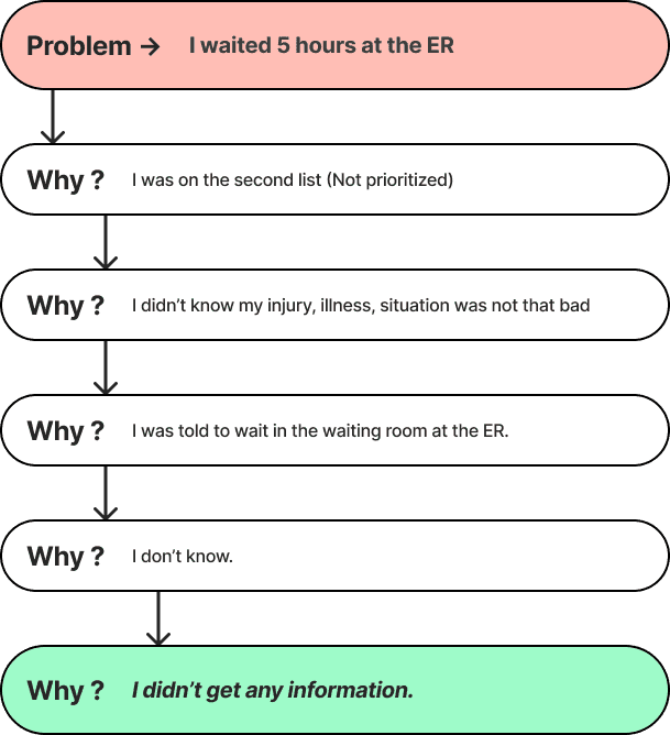
He/She feels annoyed and insecure when they don't get information. Feeling helpless towards the child when they are sitting in the waiting room at the ER. Gets frustrated and worried when they don't know how bad the situation is and not knowing how long they have to wait
He/She says that “In order to stay focused on my child, it is important that I receive updates on the phone about the situation so that I don't have to sit and look at my phone all the time.”
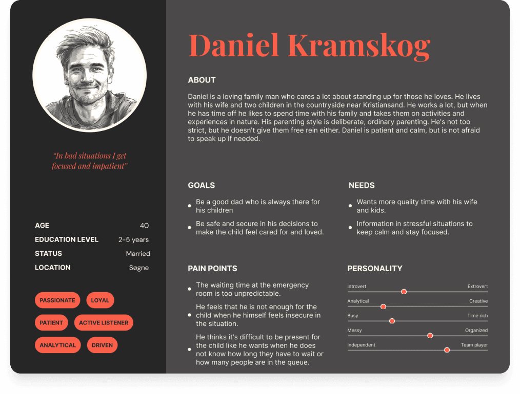
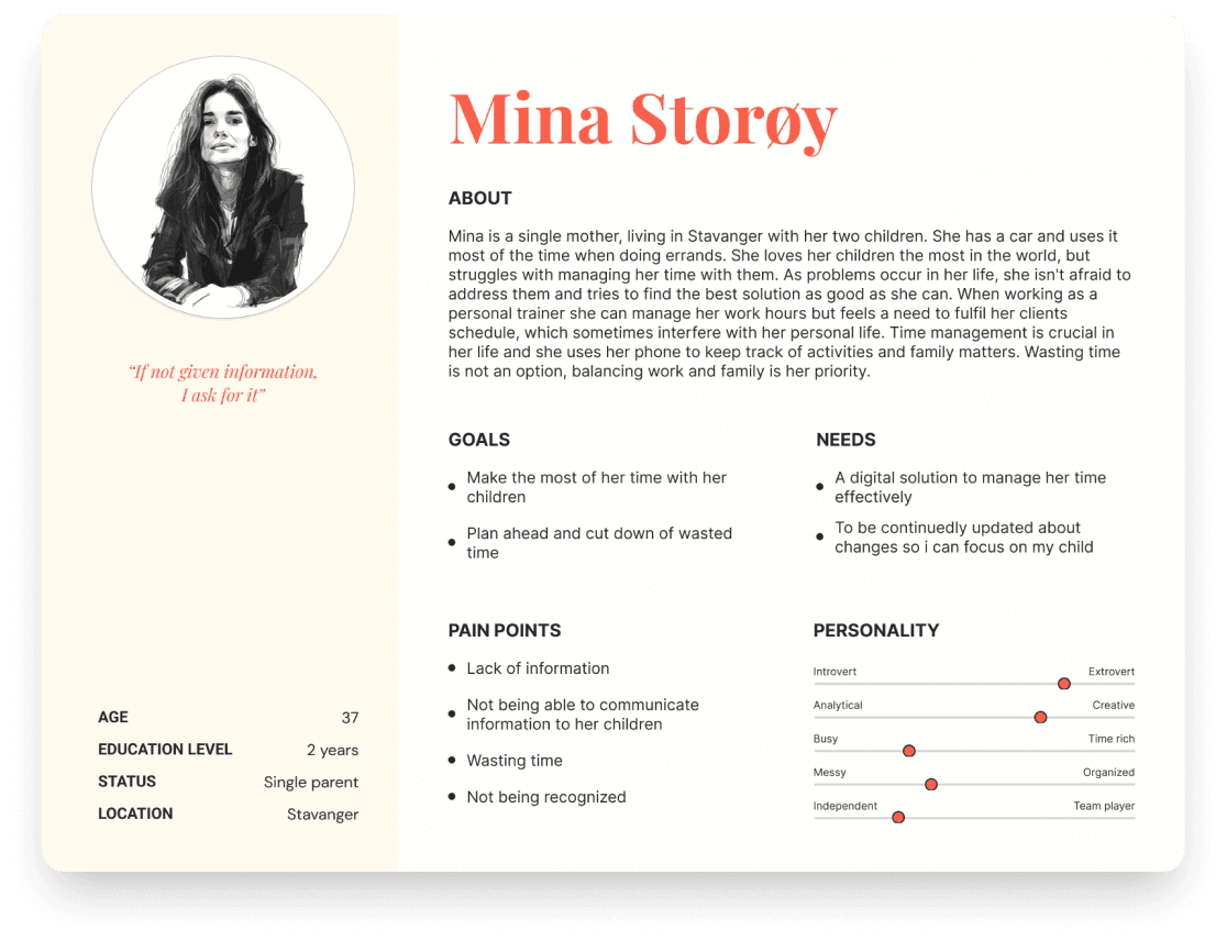
We have gathered enough information about our target user at the moment and did a primary and secondary persona. Now we can create a Scenario, User Journey and HMW to define a Problem Statement.
"Parents with a child placed at a lower triage level in the ER waiting room require real-time information about their wait time. This information reduces stress and frustration, enabling them to make informed decisions such as seeking alternative ER options if the current facility is under high pressure. Solving this problem would enhance the experience of both parents and ER healthcare personnel by reducing frustration and potentially minimizing wait times.
Additionally, it aligns with Kvikna's objective of developing a comprehensive ER solution that integrates with existing systems managed by doctors and nurses.."




Step 3 - Ideate and come up with solutions
We brainstorm potential solutions, select a concept and develop one solution.
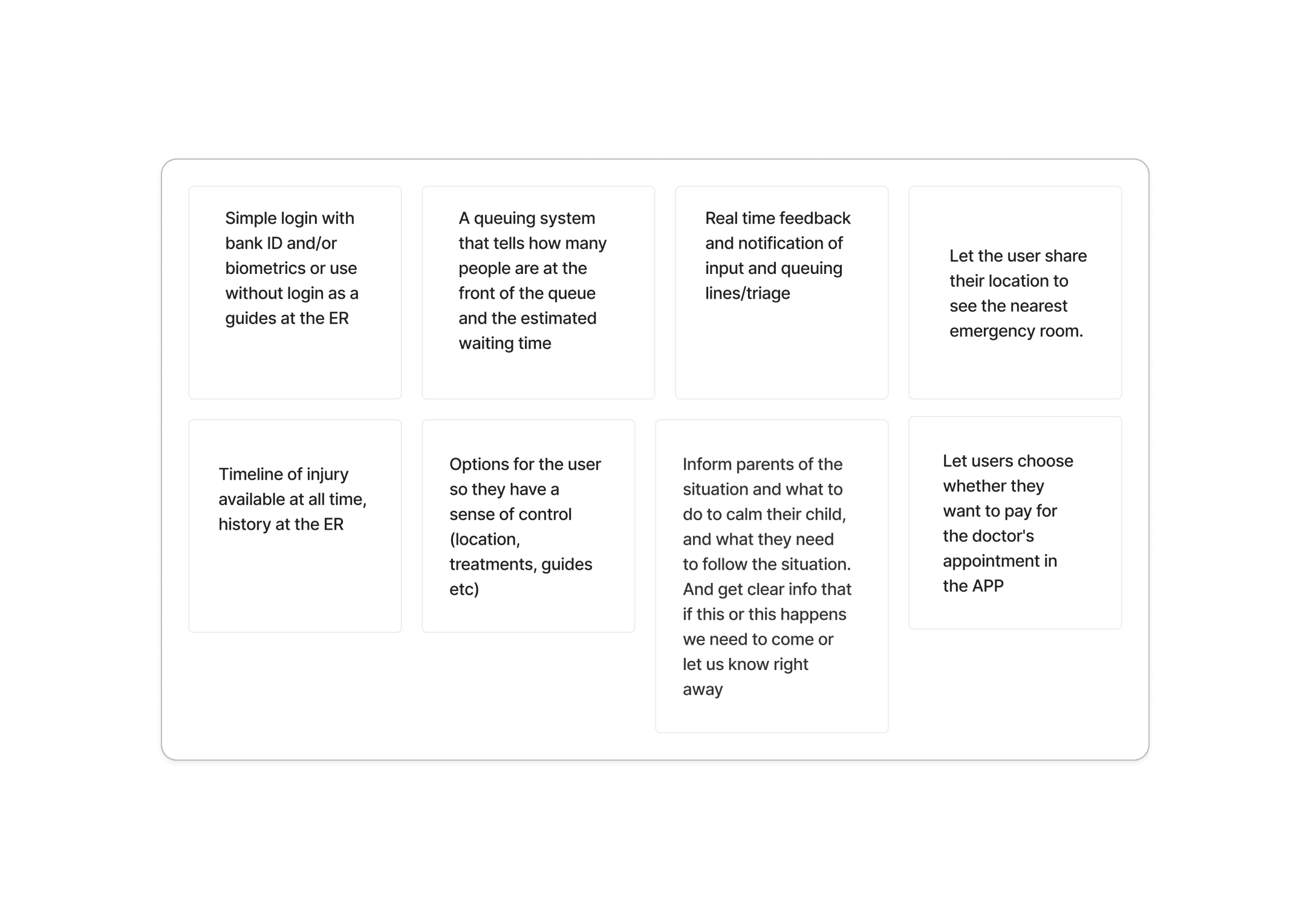
We started with our main solution, an App, from which we branched out to payment, Real time tracking, information and profile. Each of these had their own branches with further ideas.
Having a limited amount of time we used the MoSCoW-technique to help us focus on the right things to implement and what not to focus on in the first process.
Problem:
Patients feel frustrated due to the long waiting time at the emergency room.
Goal:
A digital solution that relieves the emergency room and informs the patient.
Context:
Patients feel calmer when they have an overview and control over how long they have to wait.
Sketching out our ideas separately, with the 3 levels of design (Visual, Behavioural and Reflective) in the back of our mind we came up with three different concepts. To make things a bit smoother, we had some similarities in our sketches and came up with a top solution to further refine, quite easily.
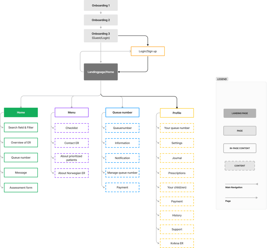
Next thing to do was the Information Architecture and Task+User flow.
Time to build a prototype and test!




Step 4 - Prototype & test our concept
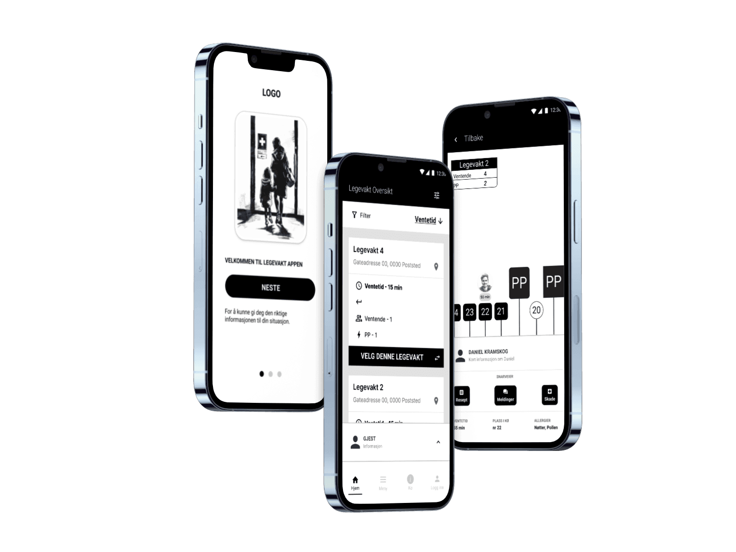
We created a digital solution in Figma to build our wireframes.
A moodboard is really important to gather som ideas and design inspiration. We aimed for a design that felt airy and employs soft, muted colours. We incorporated Kvikna's red colour in specific areas, but as this is a health app, we can't have red dominating the interface. Our goal is to evoke a sense of spaciousness and tranquility.
The design system for this project where given to us by Kvikna. We got access to their early system as they are developing it as we speak. We also got access to another system called Design systems which they are discussing to use as it is the system used by other governmental webpages and APPs as NAV, Alltin and ID porten.
Typography used is the same as Kviknas. They use Inter for a good readability on both desktop and mobile: Inter is a variable font family carefully crafted & designed for computer screens. Designed by Rasmus Andersson. Accessible at Google Fonts
The icons are based on Kviknas Icons- they are based on Material Design Icons in outline for most and some fill if outlined is not appropriate. Sizing is 24x24 px - not bigger than 32 as the lines get too thick.
We use a 4px spacing system and base all sizes and spacing on this. The grid is based on the same idea and follows 16px as margin, 32 px as padding and auto/fluid in columns - rows follow 4px spacing from top - with 16px margin
The buttons used are from Kvikna AS and Design systemet - when we need to use buttons from designsystemes we use the Primary brandcolors as Kviknas to maintain a consistent look and feel. Radius for kvikna are also followed with 8px.
It was timesaver for us to be able to use this existing well design and renowned systems in our project - we needed to develop a few components our selves - but most of the components are directly from these two systems or based on them.
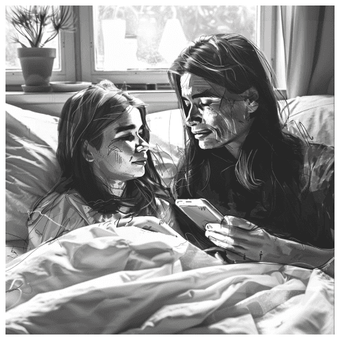
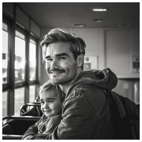
Custom made illustrations for Kvikna APP.
Illustrations made by me with Mid-journey
By using a well-known design system widely adopted by public service developers today, we can ensure excellent user-friendliness right from the start. This allows us to focus on what's essential for delivering a service with smooth functionality and user-friendliness in line with WCAG rules and recommendations.
We'll test for contrast, readability, and intuitive understanding. Since the app will be used in situations where users may feel stressed, anxious, or unwell, it's crucial for them to recognise the system - hence, it's a huge advantage to utilise a system already familiar to users in Norway.
However, we still need to adhere to the guidelines described and tailor the content to our mission and adjust according to feedback and the principles of accessibility.






Step 5 - Iterate & Refine concept from testing
After testing we god some feedback that some of the contrast was to bad, this was due to time limit that we couldn't test contrast before the Usability Test. We adjusted the APP after finding minor and some major issues with the interface. The test was performed with the use of a tool called Useberry where we can link our figma prototye and add questions and contect screens.
21 participants was tested.
18 as a single task test to perform 1 task at a time and answer questions after each.
3 participants where choosed to a remote modarate usability test with interview and recordings.
Usability test: We used Useberry for testing the user experience to identify usability issues, to see if it meets users’ expectations, and to identify if there is anything we can improve with the concept.
About the result: The test result indicate that we have created a good solution. Everyone can navigate the APP quite easily and understand it intuitively. Some minor issues have been addressed as confusion about labeling avbryt/avslutt and bekreft -which in some instances yield the same result. Other issues is due to our time constrains, such as adding language options and a dark mode choice. As this is a governmental Health APP there are strict regulations regarding WCAG - inclusive design and accessibility. These aspects must be furter tested to meet all requirements.
Further improvements: The issues addressed include the size of the CTA buttons and the distance between some of the buttons and links. The language also needs to be tested to ensure it is clear and friendly, without feeling demanding or negative in any way. It’s important to remember that people may be in a critical situation, so an extra empathetic approach to the tone of voice is necessary. To summarise - the APP have received a very good first impression is the feedback from all testers, and with an overall task success rate over 90% we feel we have managed to meet the users needs and pain points in a MVP product.
The Design Thinking Process is continuous, and we would go back and forth to keep refining our product.




Summary
Imagine the relief and time-saving benefits that a self-registration app could provide, considering that emergency room staff typically spend 8 minutes per patient on registration alone (ref. Kvikna & Sykepleien). Even if only patients with lower triage levels could self-register, it would offer significant assistance, allowing emergency room personnel to concentrate on higher triage patients and other critical tasks.
The Kvikna app primarily serves as a registration and queue management tool. Its main objective is to provide patients, particularly those with lower triage levels, with information about queue status, estimated wait times, and reasons for delays if higher triage patients enter the queue. By designating these patients as PP (Prioritized Patients) and keeping them anonymous, they never have to engage with the queue system as they receive immediate treatment. This not only facilitates easier understanding and patience among patients with lower triage levels but also ensures smoother operations.
Another essential feature appreciated by testers is the ability to input health information, including allergies and medications. Additionally, the option to set reminders, either by the user or their physician, is supported. Given that only approximately 60% of received information is typically retained,(Article on medium) ,this feature is crucial, especially in critical situations, for patients with poor short-term memory or memory loss due to illness or injury. Therefore, having an app that offers reminders ensures that patients remember important details of their treatment and healing upon returning home.
Introducing images instead of avatars has the potential to enhance the product, bringing patients and emergency services closer together. The attending doctors and nurses, equipped with visual cues, can greet patients more empathetically, fostering a sense of closeness. Furthermore, fostering a relationship between patients and emergency services can even reduce stress. For instance, a parent could inform their child that 'Doctor Ove will arrive in 15 minutes, and here is how he looks like' establishing a sense of familiarity and trust, even before the appointment.
Thanks Kvikna AS for letting us cooperate on this project - and a special thanks to David for continuously giving us insight and feedback.